Positioning a new brand for future success
Acadia Investor Relations is a newly established strategic communications firm focused primarily on the CPG, Grocery and Cannabis categories. In the leadup to launch, founding partners Katie Turner and Rachel Perkins engaged Bailey to help realize their vision for the brand, and to capture and communicate its values to the world.
Bailey led a comprehensive naming and identity initiative, beginning with in-depth stakeholder interviews. The insight uncovered informed our approach to naming, and “Acadia” resonated strongly with the core tenets of the brand. Named for the century-old National Park on the coast of Maine, Acadia is the first place in the United States to see sunrise. Contextually, the name signifies new beginnings and suggests unparalleled foresight.
Bringing the New Acadia Brand to Vibrant Life
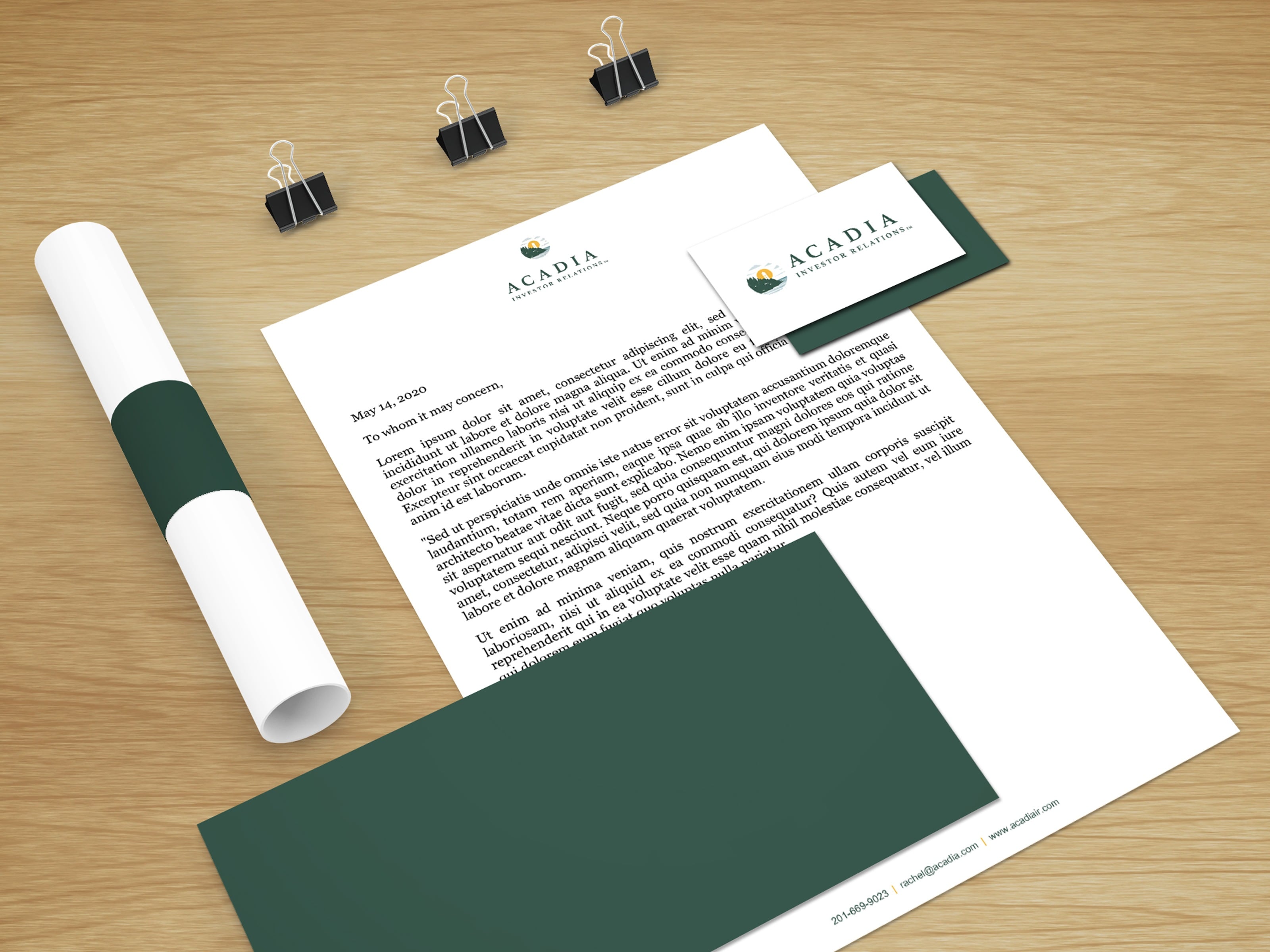
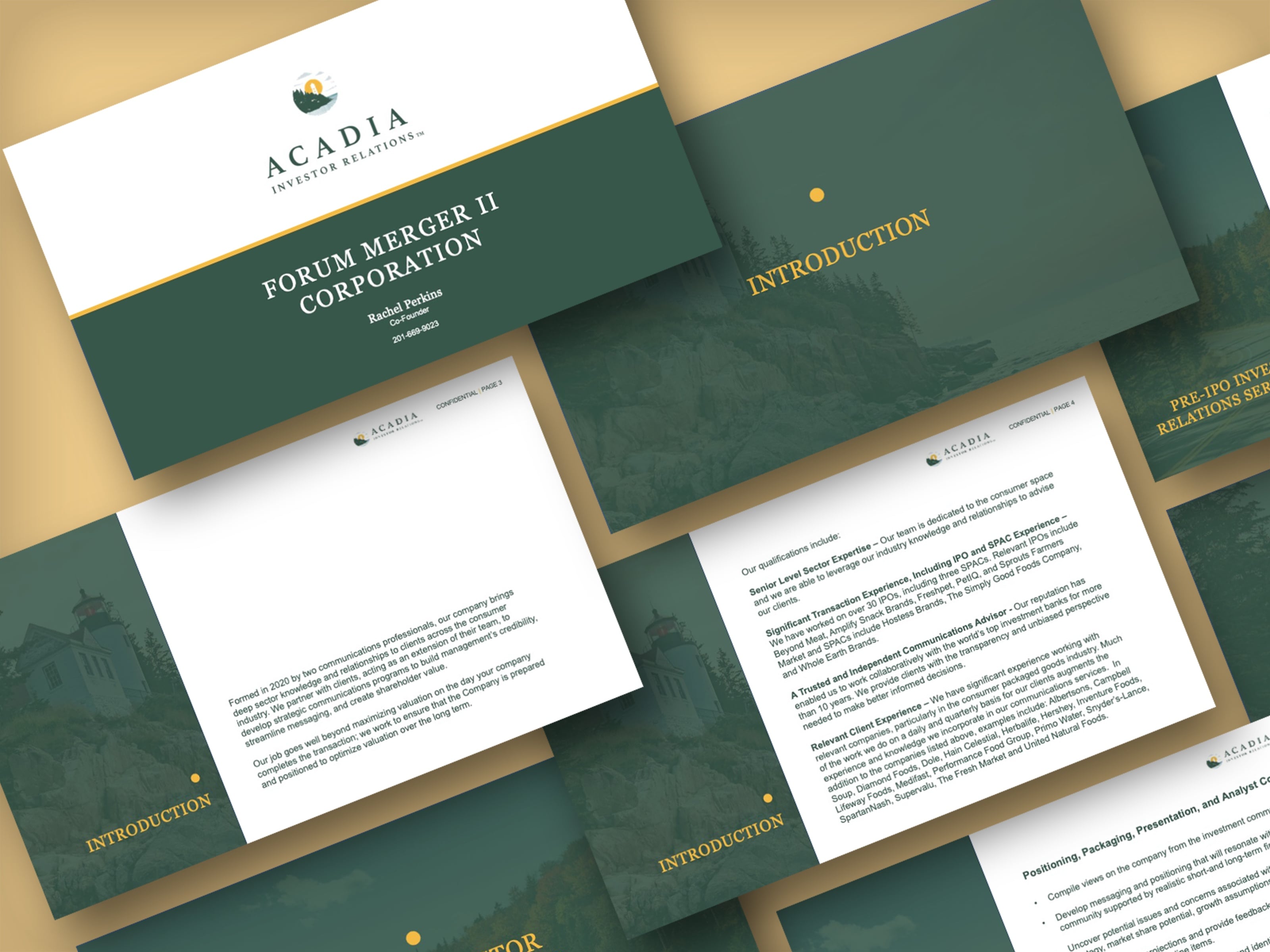
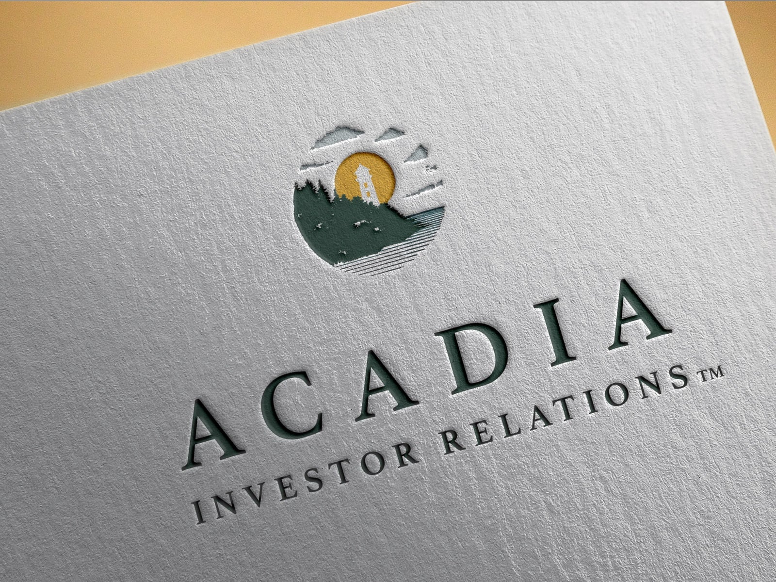
Bailey then brought Acadia to life by creating a new, contemporary visual identity. The logo prominently features a lighthouse set against the rising sun, positioning the firm as a beacon its clients can steadfastly rely on.
The design system features classic serif typefaces, which convey sophistication and experience. A subdued color palette of primarily yellows, blues and greens was used to convey energy, wisdom and positivity. The new logo and branding were then applied to a range of distinct assets, including stationery, business cards and a presentation template.
